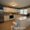
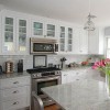
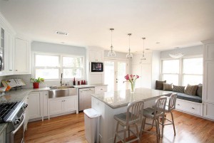
 This kitchen was large, but poor design made it seem small and dark. We maximized the cabinetry layout and custom built new cabinets. The new cabinets feature flush-inset, Shaker style doors, soft-close drawers and doors, glass doors, and custom height to the ceiling. We also replaced the laminate floor with oak, lightened the wall color, and added lots of lighting. The result is a transformed kitchen: bright, open, crisp and inviting.
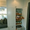
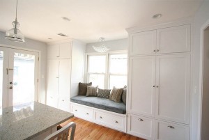 The side wall was originally bare and contributed very little to the kitchen. We added floor to ceiling pantries and a window seat to make use of nearly every inch of space.
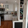
The sides of the end cabinets were painted to be magnetic chalkboards. This adds a personal touch to the kitchen, as the upper cabinet now houses sentimental souvenir magnets, and the lower is ready for kids’ scribblings.
The backsplash is a perfect complement to the kitchen. The beveled subway-sized tiles exude classic historic style. The marble mosaic above the range provides a focal point that incorporates the colors of the kitchen without being overpowering.
(click on the photos for a larger view)
