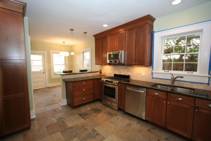
 The kitchen was a large room, but was not maximized. The cabinet lay-out awkwardly overemphasized the length of the room, there was no gathering spot, and there were wasted walls. This is in addition to the outdated look.
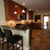
The new layout widened the feel of kitchen space with the addition of an elevated bar. The bar delineates the kitchen proper and the space that is to be a breakfast nook. Now there is a natural gathering spot for guests to keep the chef company, and two eating areas.
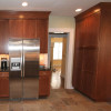
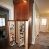
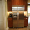
A previously empty wall was optimized by moving the refrigerator there and flanking it with cabinetry and counters. A very useful pantry cabinet was also added to this space.
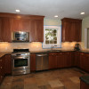
The linoleum floor was replaced with slate tiles, the counter is a gold-flecked granite, and the backsplash is a tumbled travertine, which picks up the gold accents in the granite and echos the matte finish of the slate floors.
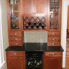
The previously empty wall between the kitchen and living room was the perfect place for a Butler’s Pantry. We used the same cabinetry and granite as the kitchen to provide continuity, but differentiated the piece as well.
We installed drawers directly on the counter to provide a more furniture-like effect. The homeowners also selected an coke-bottle green glass tile for the backsplash, which adds iridescence to the piece.
The wine rack, wine chiller, and glass cabinets housing glassware make this an elegant adult beverage center.
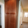
The new pantry cabinet provides tons of valuable storage space. This wall originally had nothing on it, and it is now being completely maximized for usefulness. All of the cabinetry was taken to the ceiling and topped with a decorative crown molding.
